An independent, founder-led studio creating design that lasts and brands that matter.
-
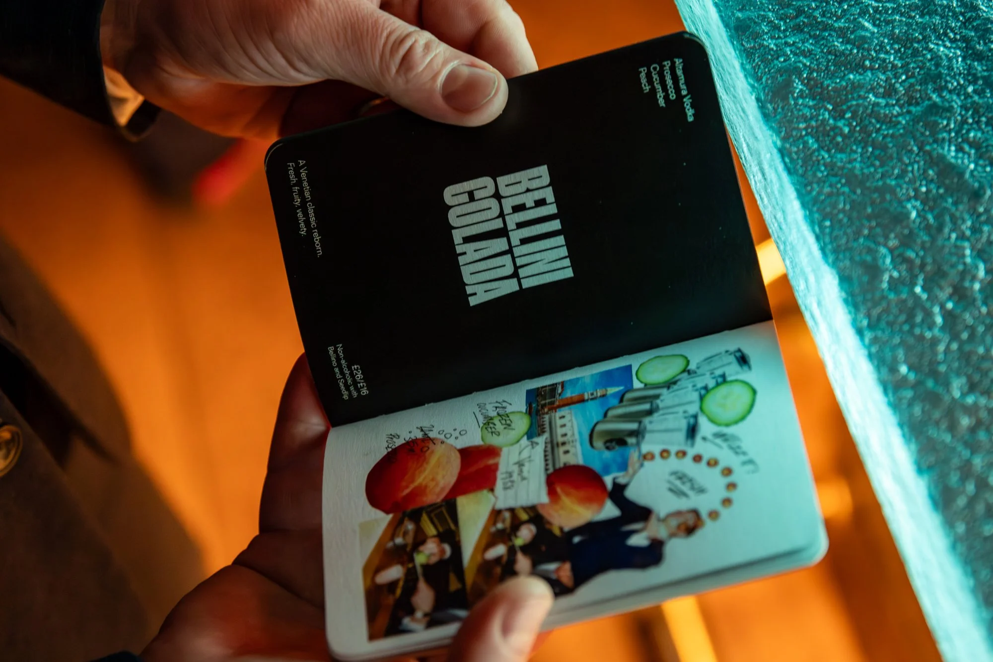
Showcasing the playful side of a 5-star establishment, the 2025 Donovan Bar menu design highlights the fun and passion behind these reimagined classic drinks. It features the extensive preparation, testing, and dedication that goes into crafting every unique cocktail, something that often goes unnoticed. Custom artwork traces each drink's journey, from inspiration to experimentation to final recipe, all designed to reflect a bartender’s notebook–full of notes, mistakes, and revisions, to reveal the hidden effort behind perfection.
MENU SPREAD 01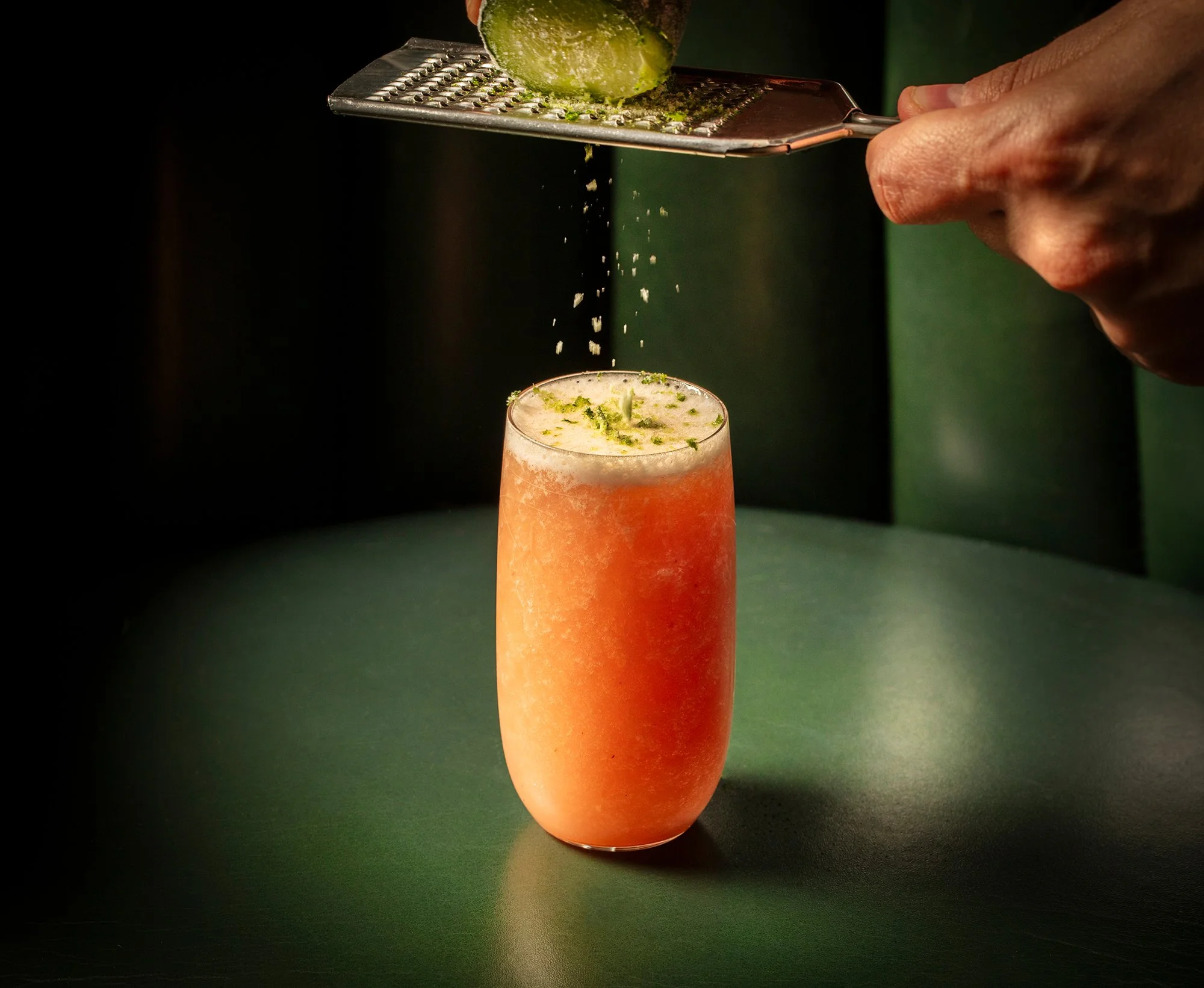
BELLINI COLADA
BEHIND THE SCENES 01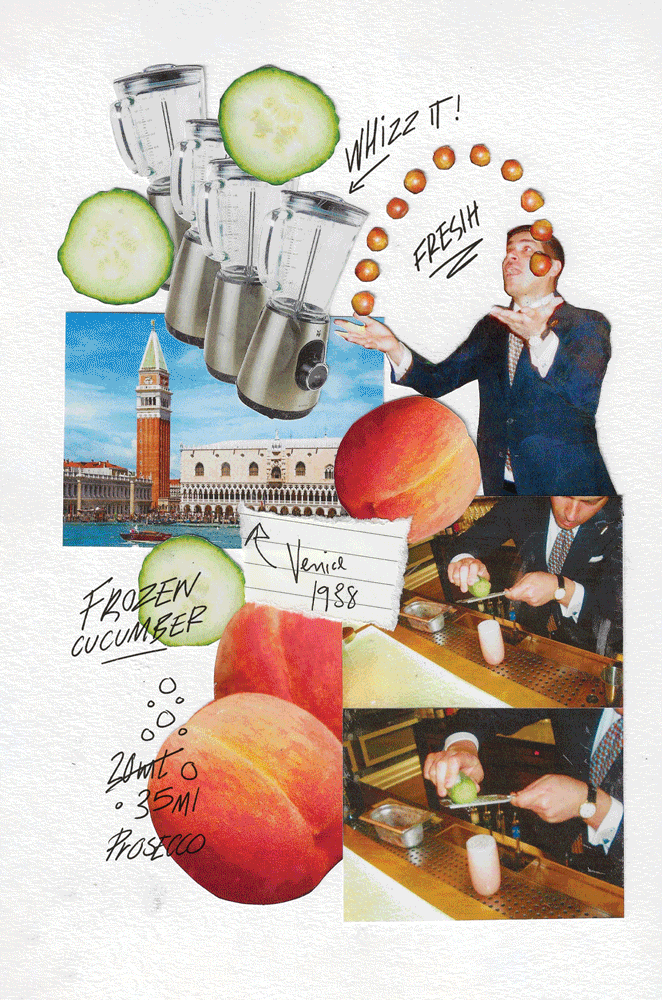
FULL COLLAGE SUITE
TYPOGRAPHY LOCKUP
TARTE OLD FASHIONED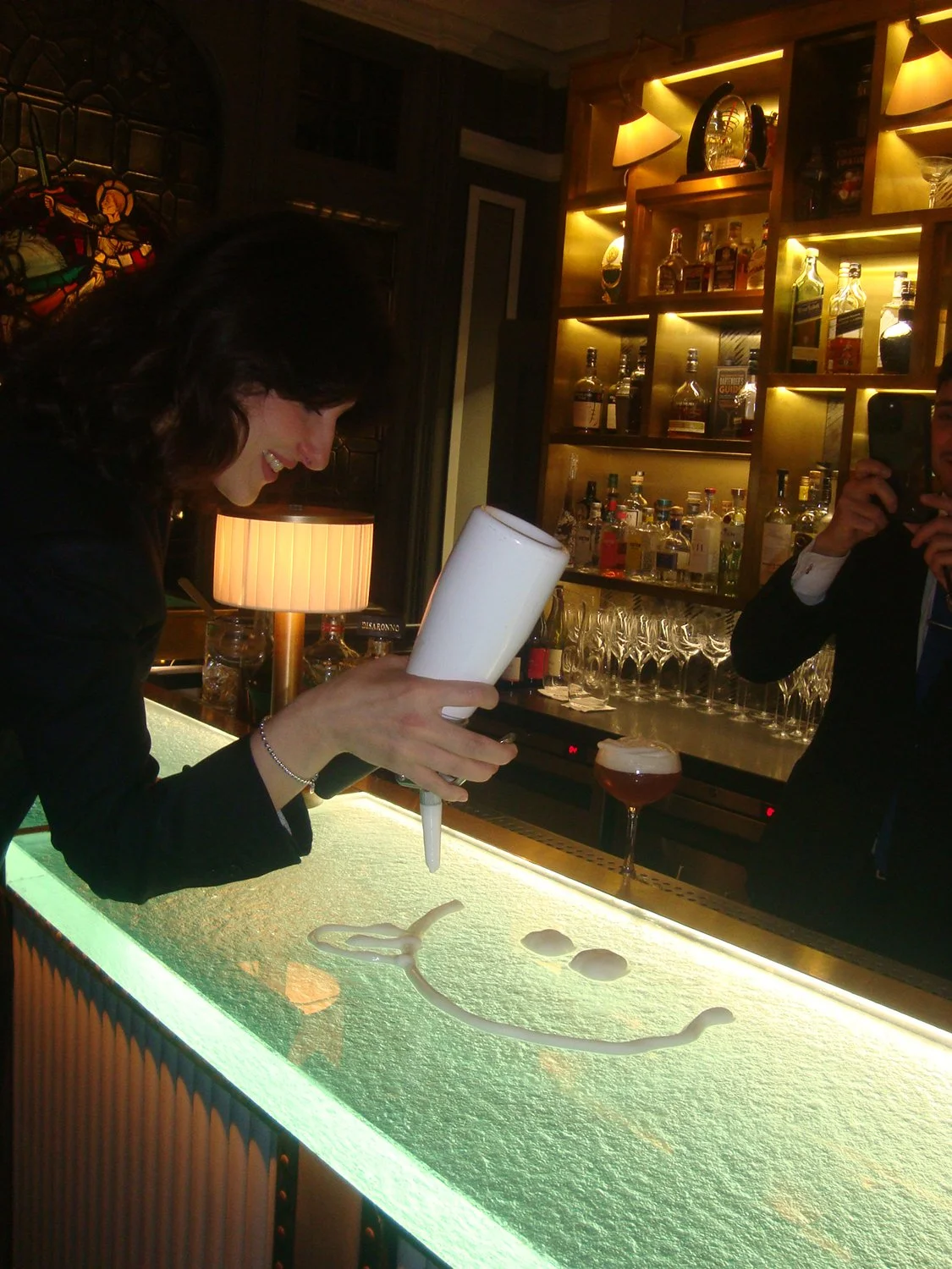
BEHIND THE SCENES 02
MENU SPREAD 02-
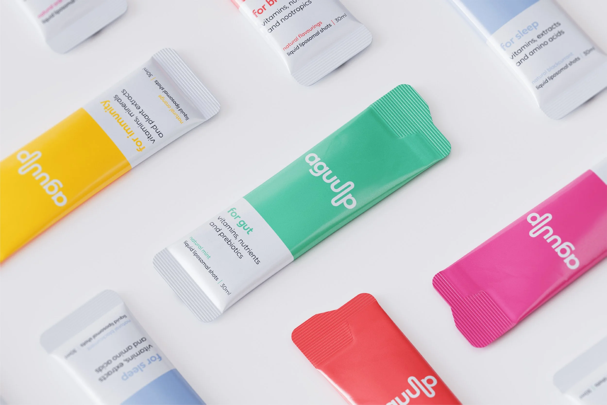
With the abundance of competition in the supplement sector, Aguulp needed an identity system that would clearly set them apart from the numerous overused taboos and clichés commonly seen in the industry. The goal was to create something straightforward and direct, yet still maintain a sense of familiarity. Central to this approach was the logo design, which vividly illustrates exactly how the product is intended to be taken.
SACHETS 3D RENDER 01
IN USE 01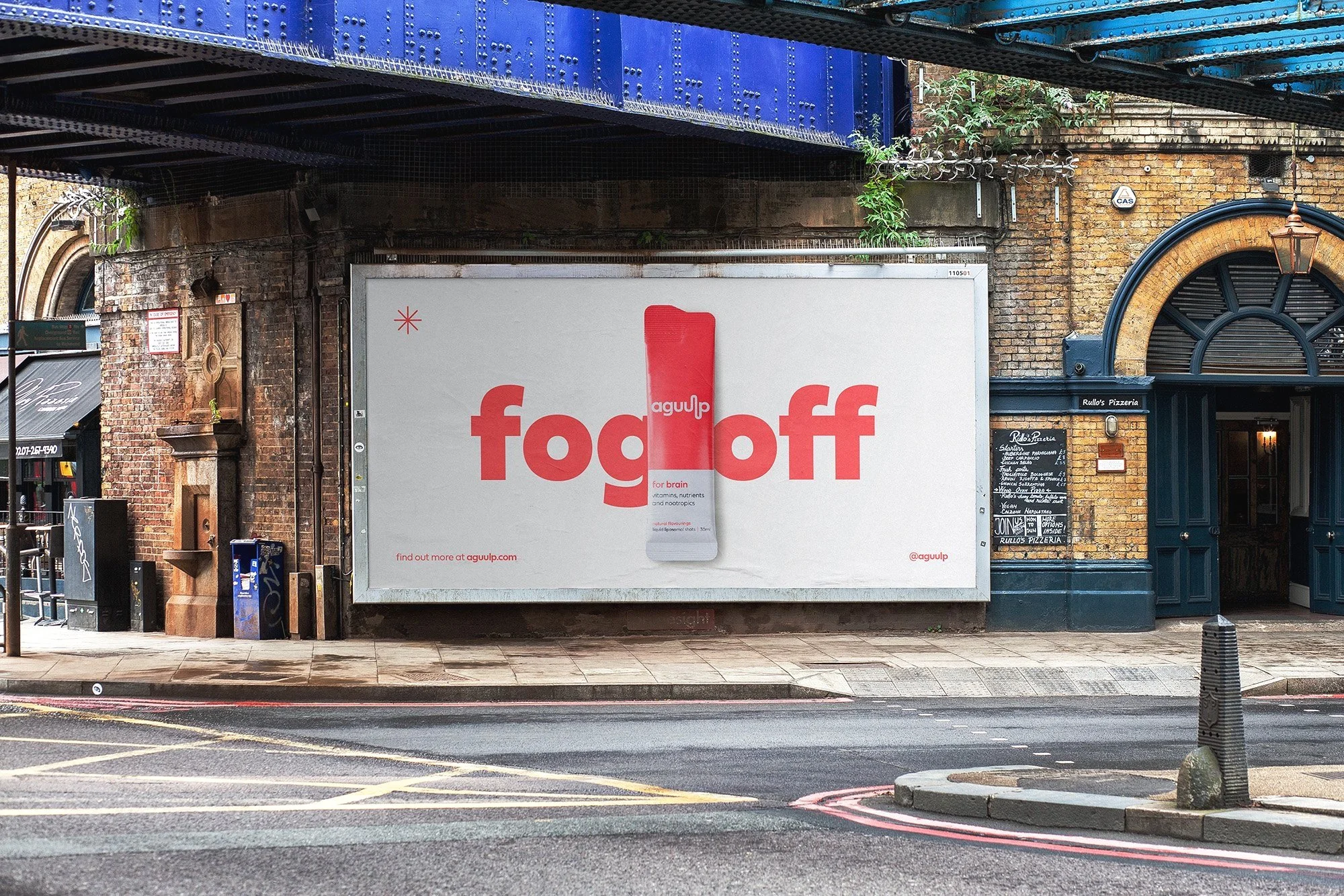
TONE + MESSAGING
OUTER CASE 3D RENDER 01
OUTER CASE 3D RENDER 02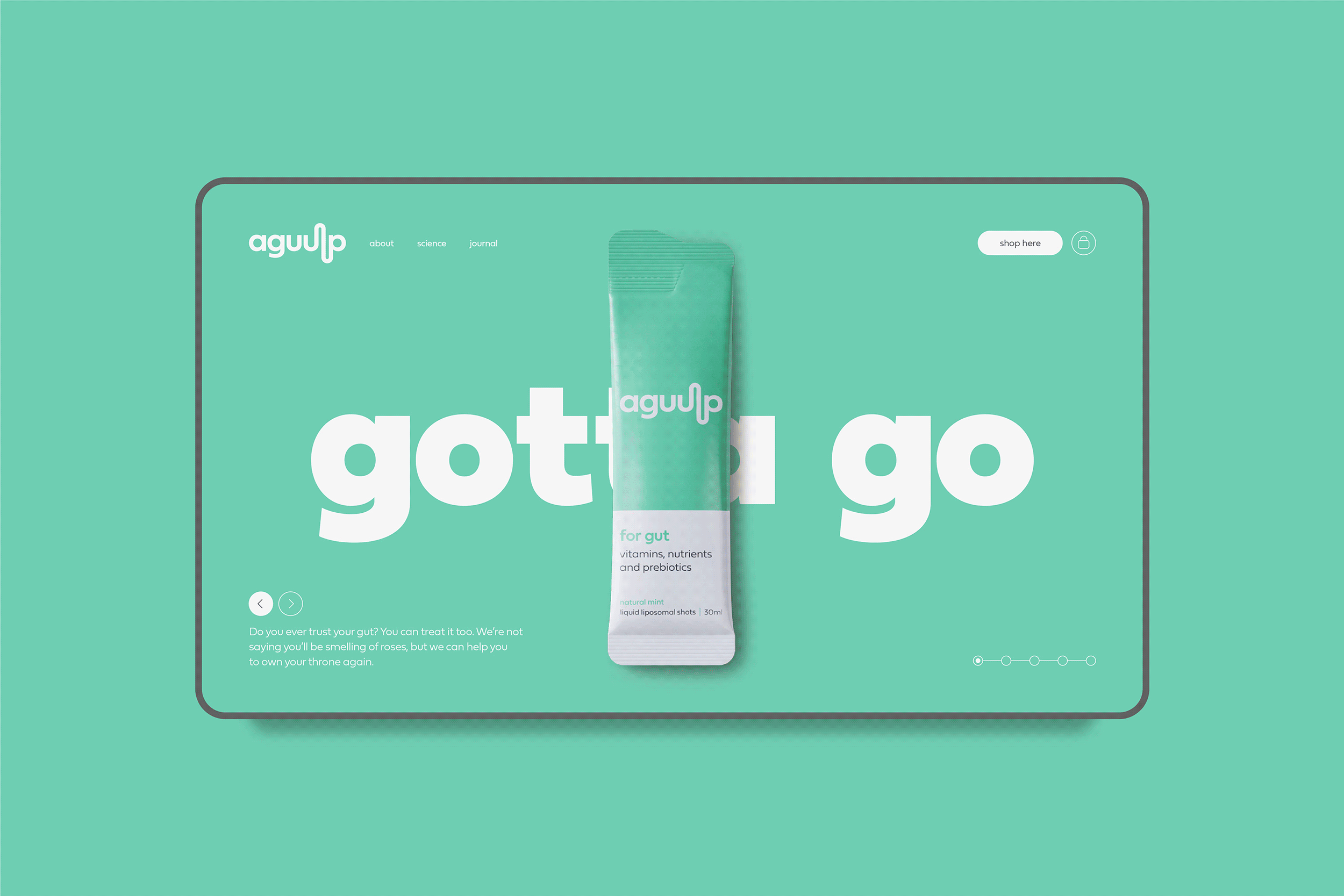
WEBSITE DESIGN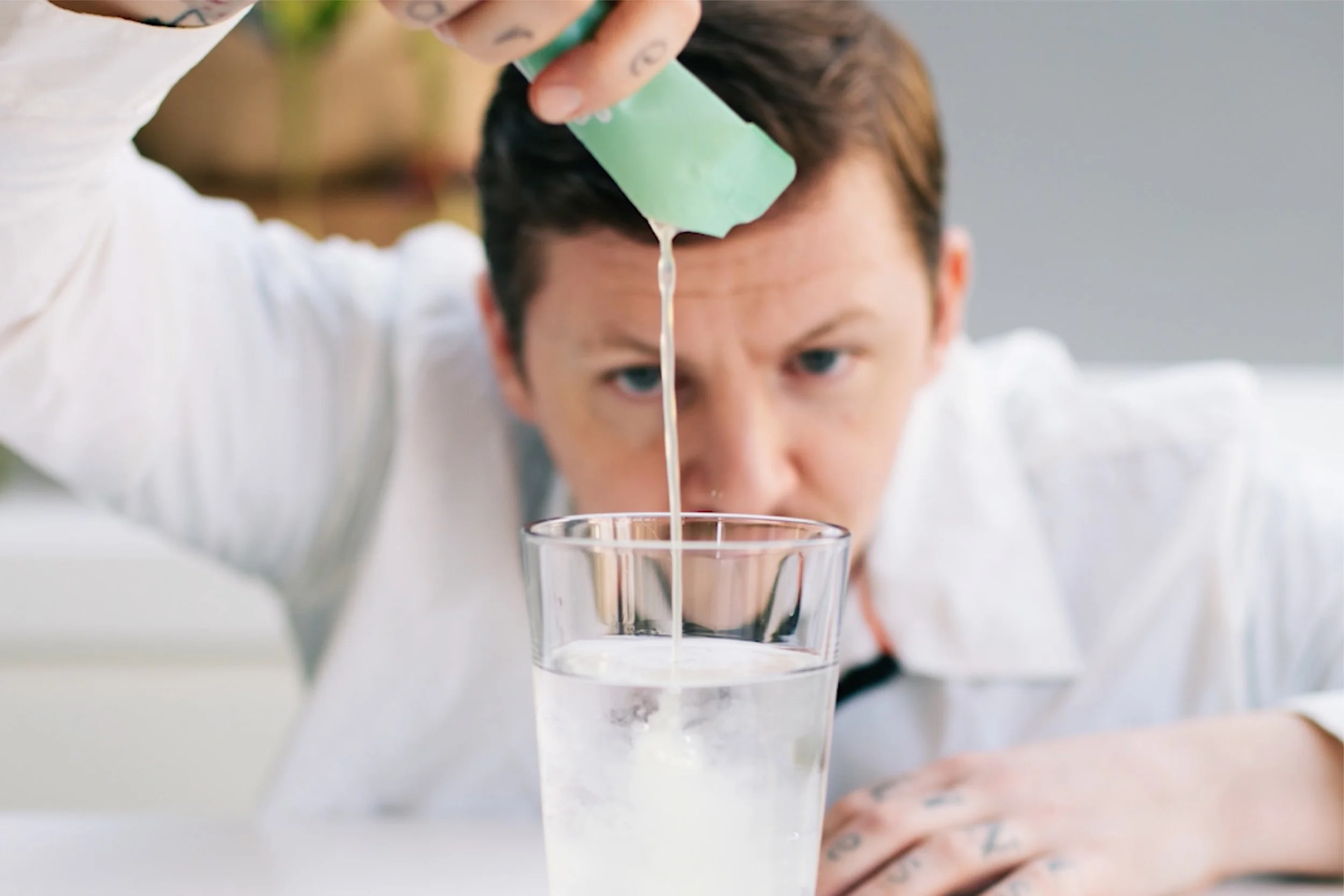
IN USE 02
SACHETS 3D RENDER 02-
An established brand with a decade of experience sought a fresh identity to reflect their high-quality, eco-friendly modular living spaces. Designed to restore and blend with nature, the new visual style draws from the landscape, using a subtle aesthetic inspired by organic shapes and topographical maps, highlighting the bond between home and terrain.
LOGOTYPE DESIGN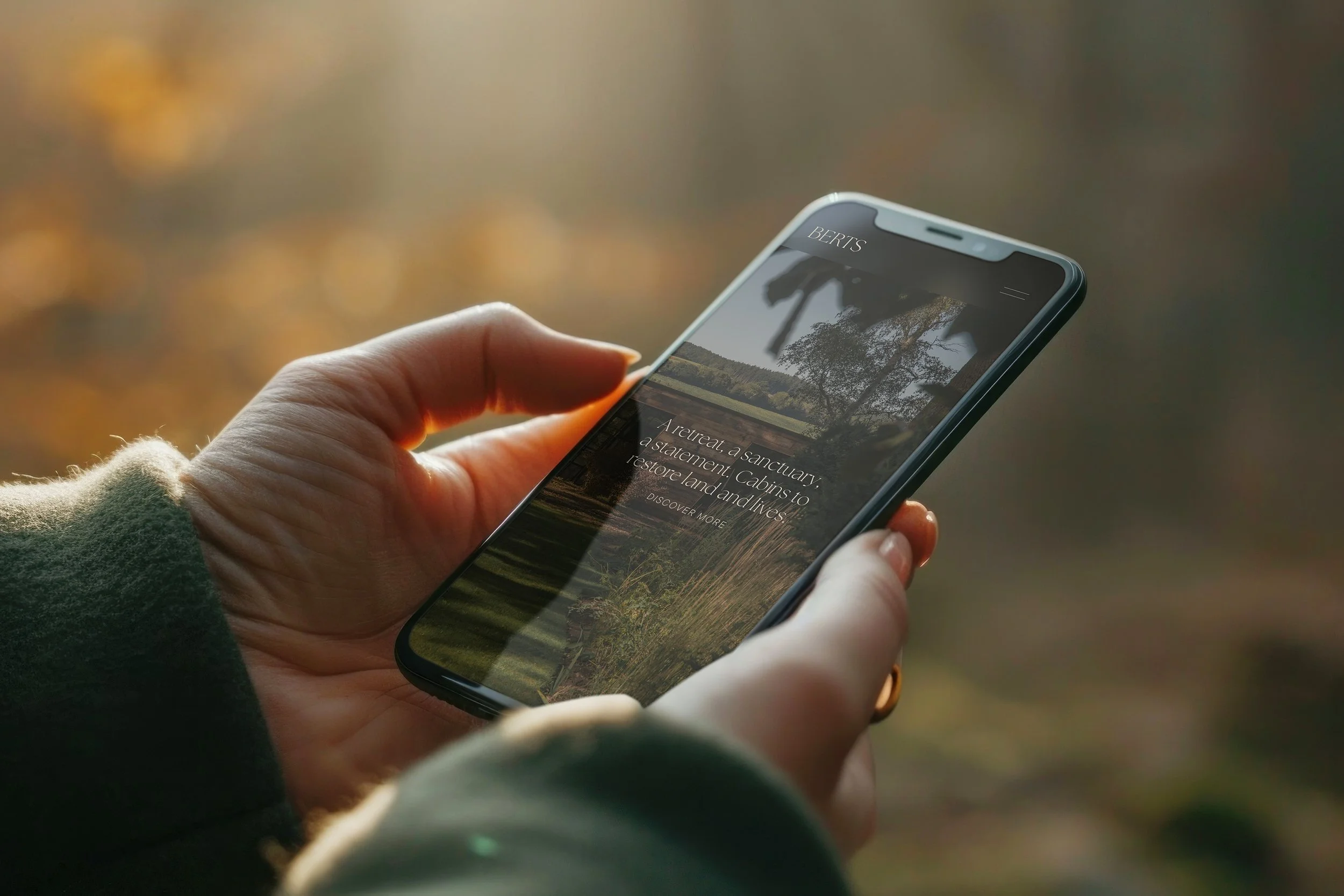
MOBILE WEBSITE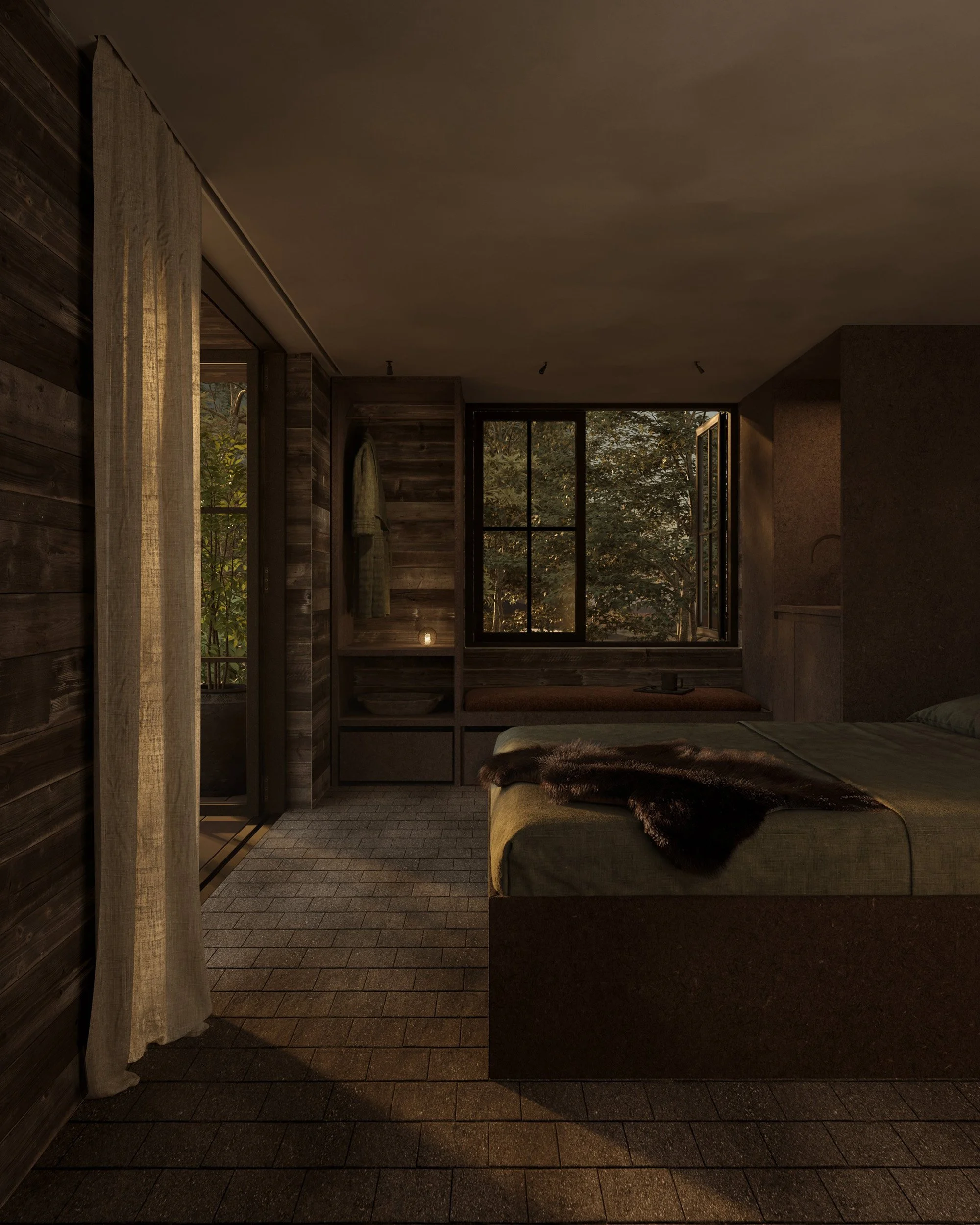
INTERIOR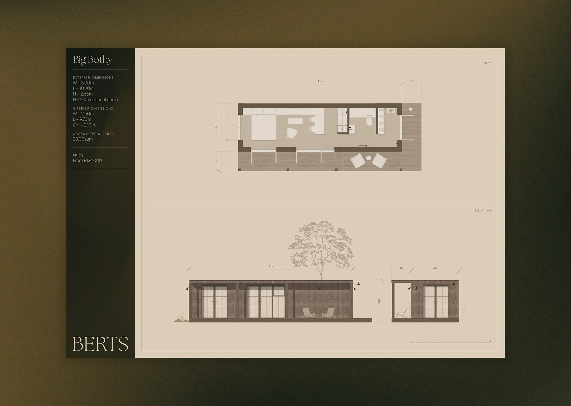
TECHINCAL DRAWINGS
PRINTED BROCHURES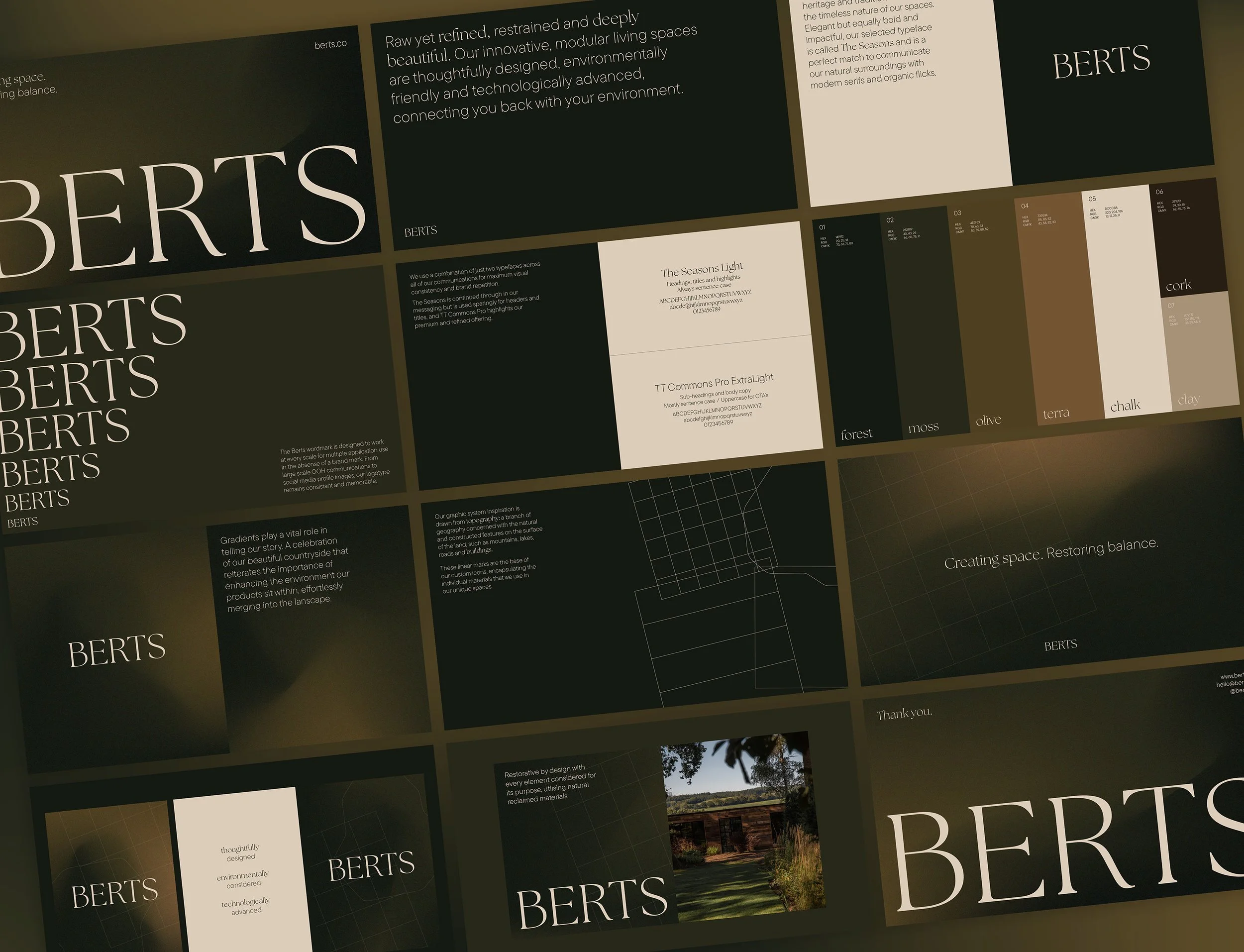
BRAND WORLD
CORE MESSAGING-
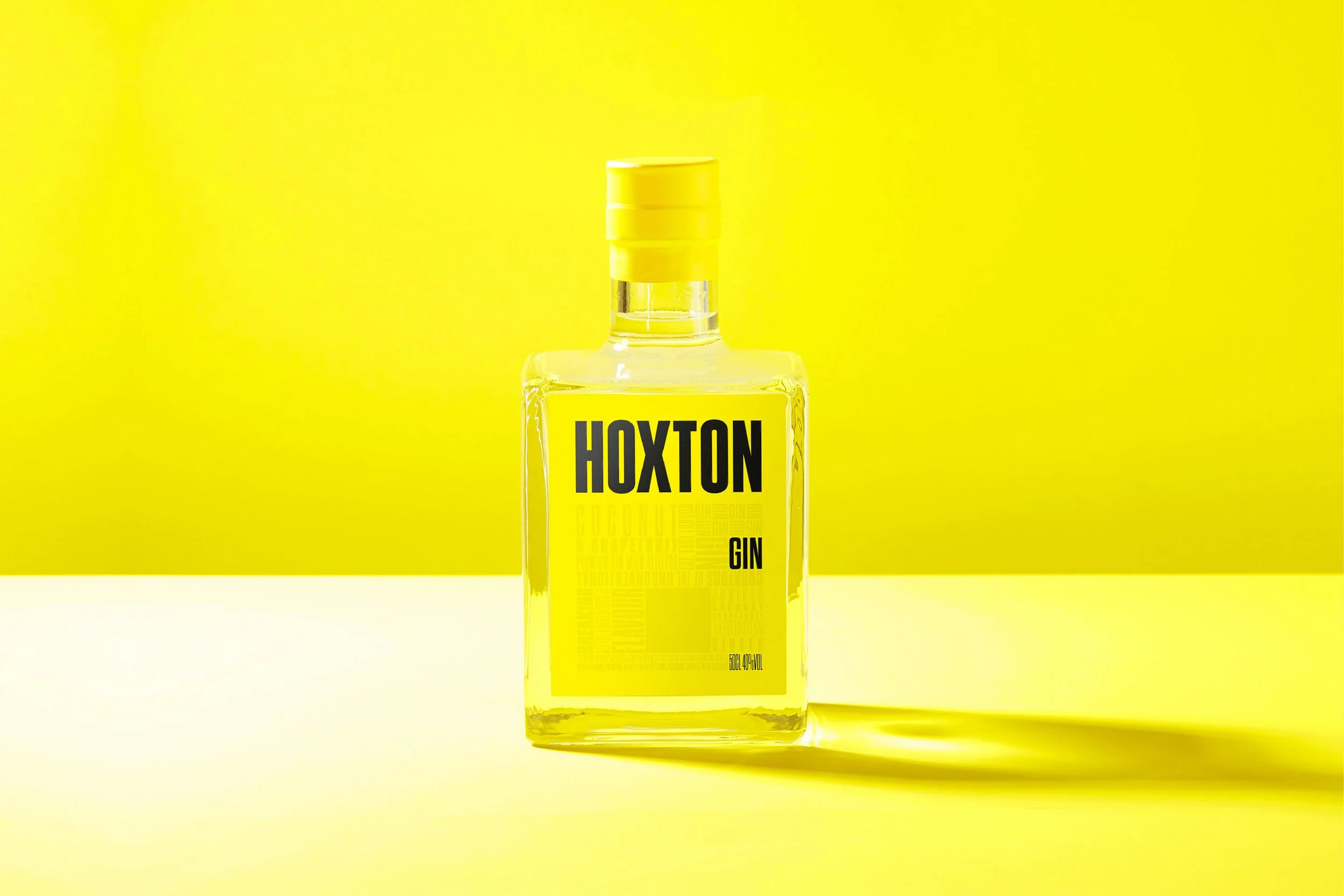
A rebellious spirits company needed a rowdy new look to match their unconventional flavour combinations. Inspired by defying art movements of the early 20th century, Hoxton Spirits required an adaptable identity system and impossible to ignore packaging solution which unapologetically stands out amongst its competitors.
PACKAGING DESIGN 01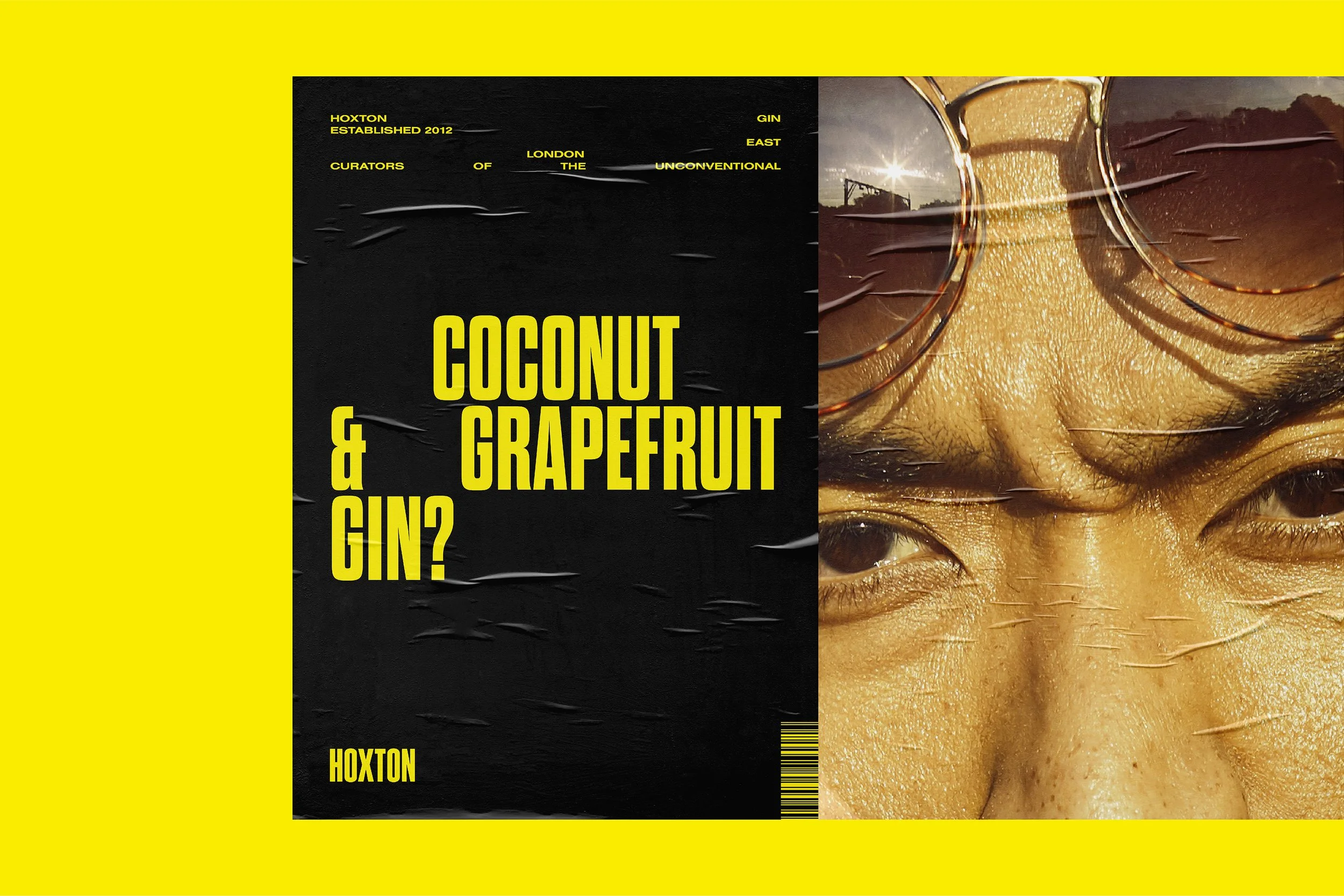
KEY MESSAGING 01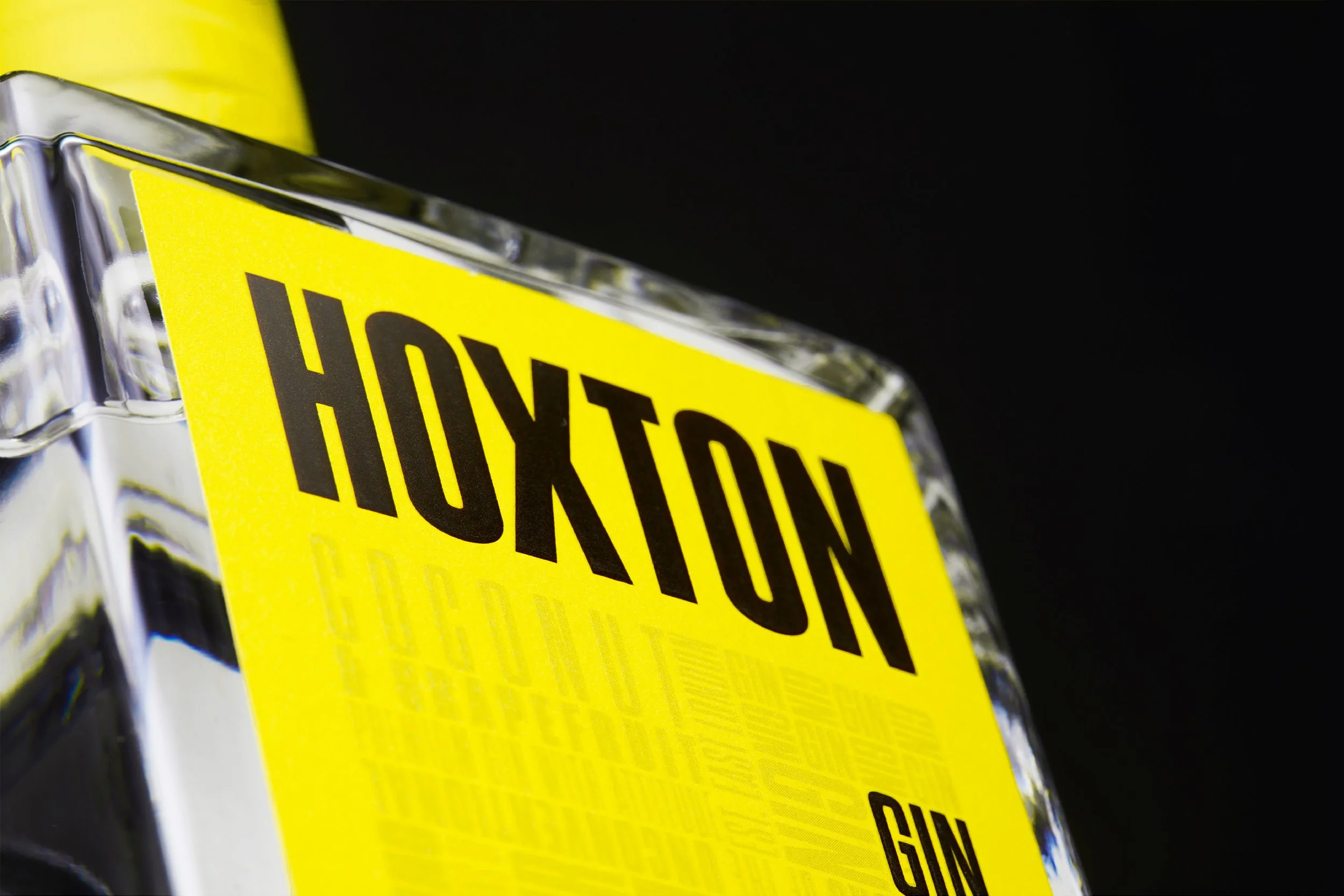
TYPOGRAPHY DETAILS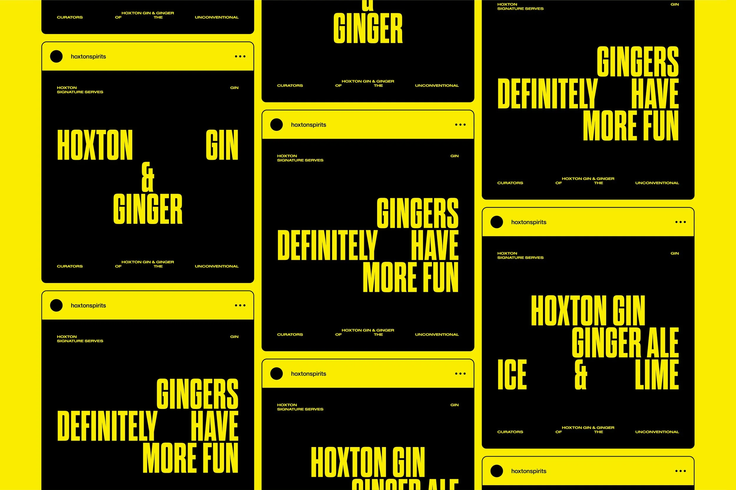
SOCIAL MEDIA CAMPAIGN
KEY MESSAGING 02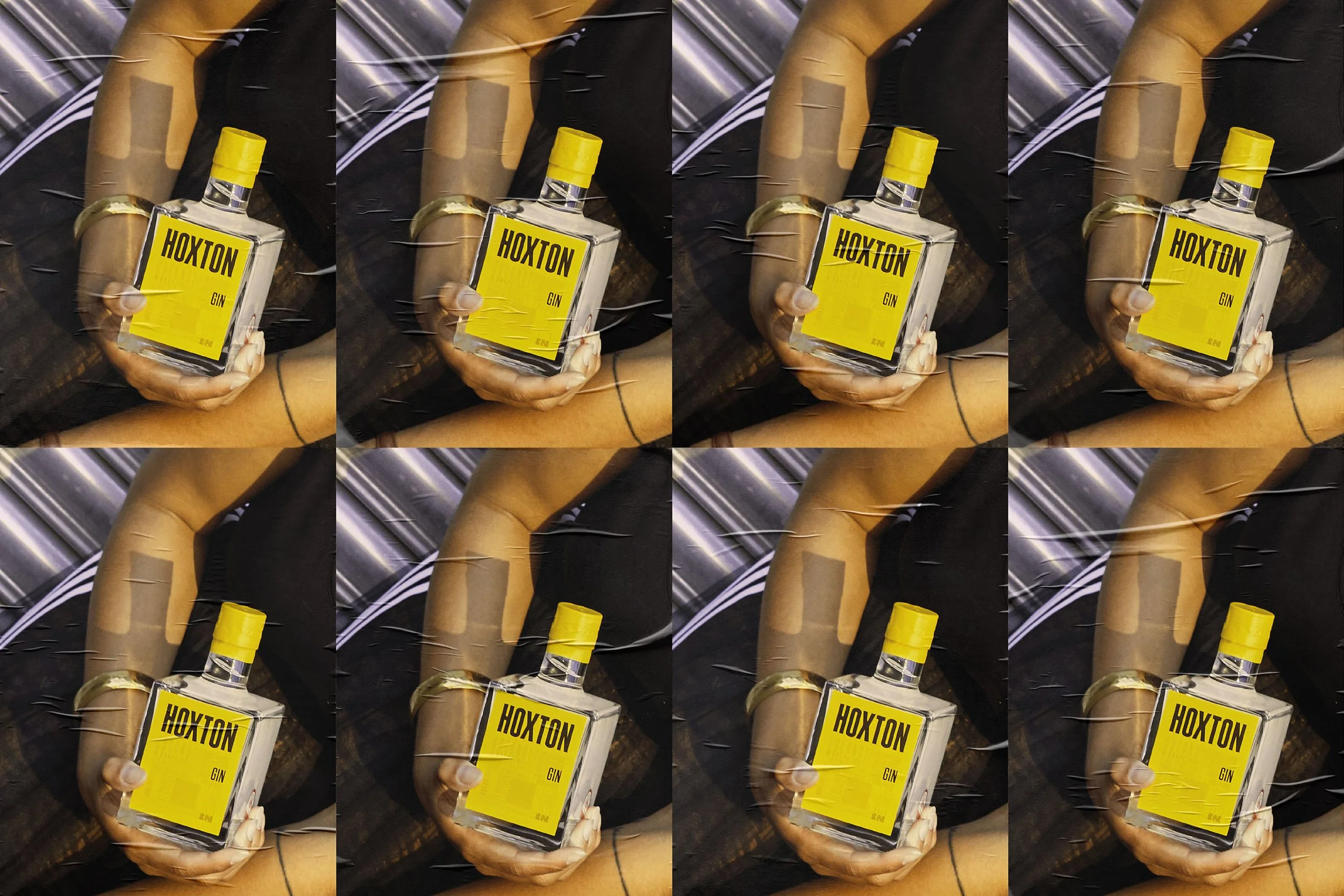
PACKAGING DESIGN 02
ADVERTISING CAMPAIGN-
Each year, the Donovan Bar creates a unique cocktail menu based on a new theme. Their 2024 concept embraced whimsical magic, taking you through classic fairytales like Jack and the Beanstalk, Cinderella, and 101 Dalmatians. The menu includes custom wood-carved illustrations that capture the stories and ingredients behind the unique drinks.

MENU + CASE 3D RENDER
OUTER CASE 3D RENDER
MENU SPREAD
HEAD IN THE CLOUDS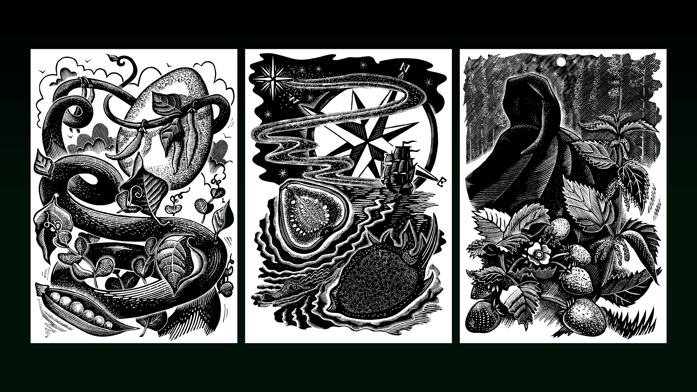
FULL ILLUSTRATION SUITE
HAND-CARVED WOOD BLOCK
MIDNIGHT SCANDAL-
As part of an extensive on-trade project, Cointreau needed a versatile activation toolkit for global markets. The cohesive, dynamic visual strategy and the activation name ‘Shake It Up with Cointreau’ create communications that appear tossed inside a shaker, symbolising the margarita’s heritage and the campaign’s energetic goal: to remind consumers of the very first margarita.
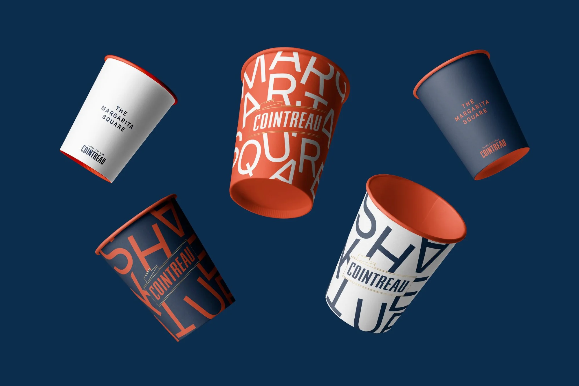
EVENT CUPS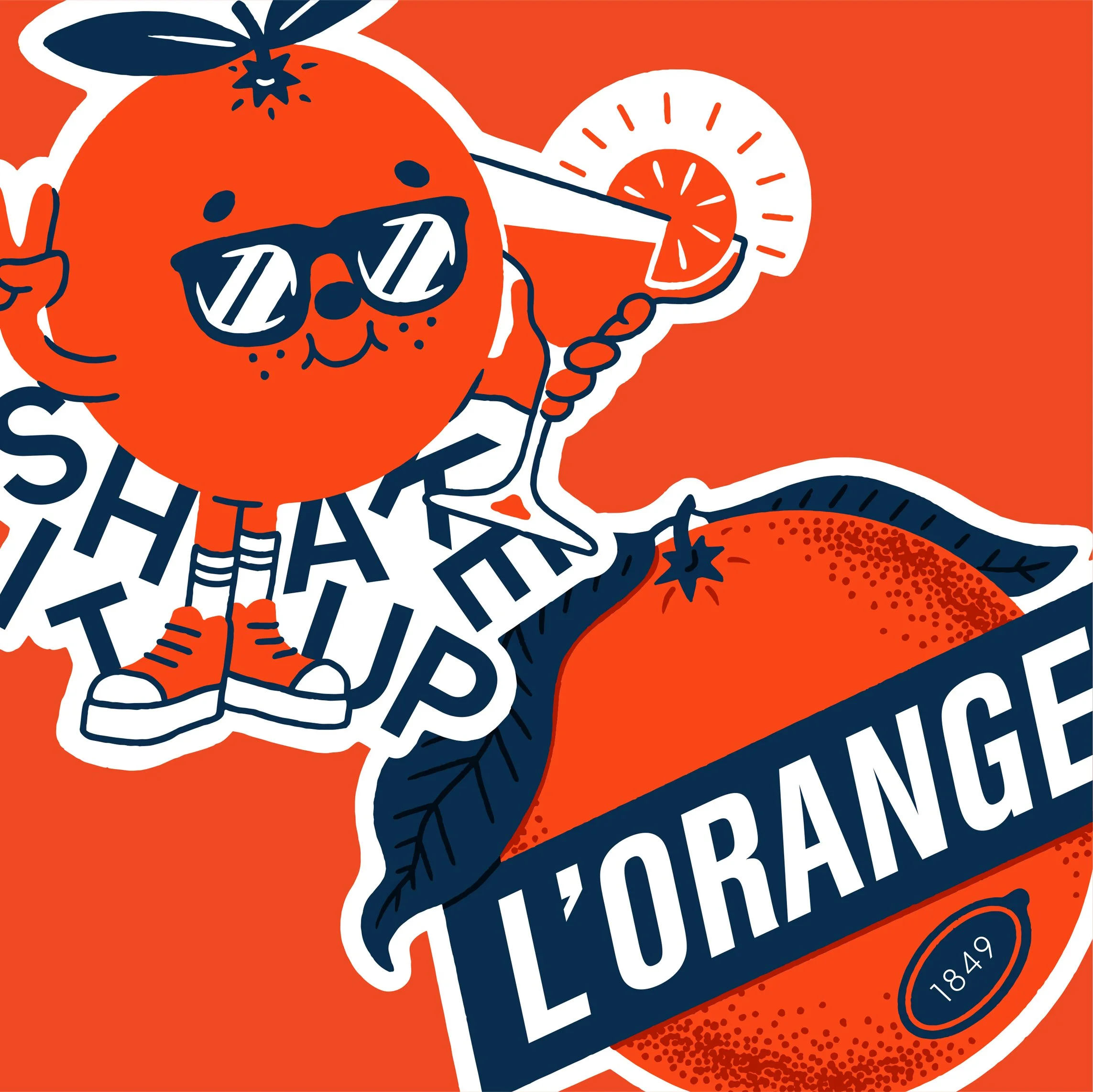
POS STICKERS 01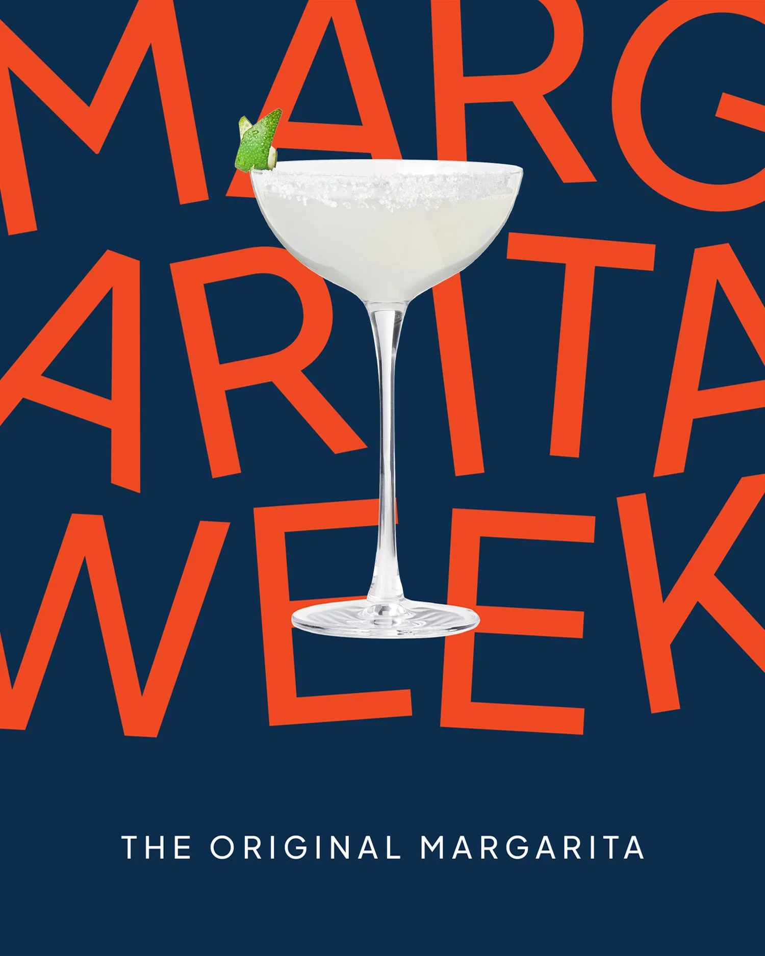
VISUAL LANGUAGE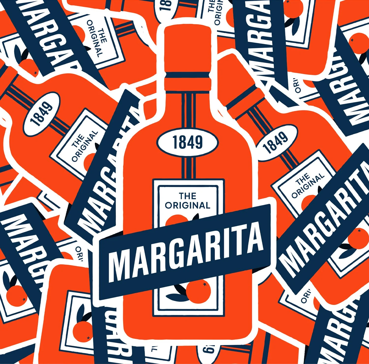
POS STICKERS 02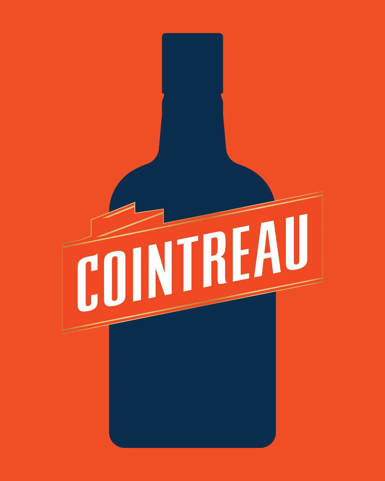
MINIMAL ACTIVATION ASSETS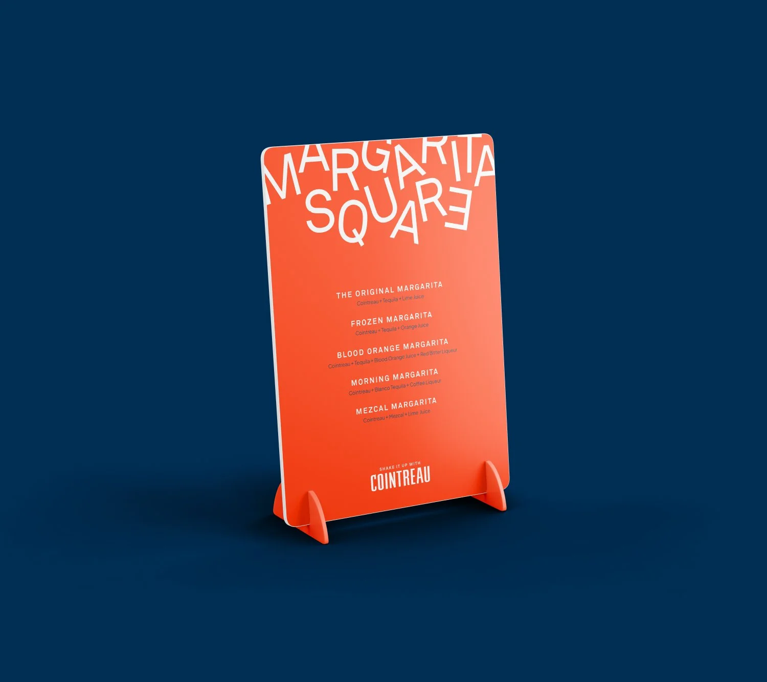
MENU DESIGN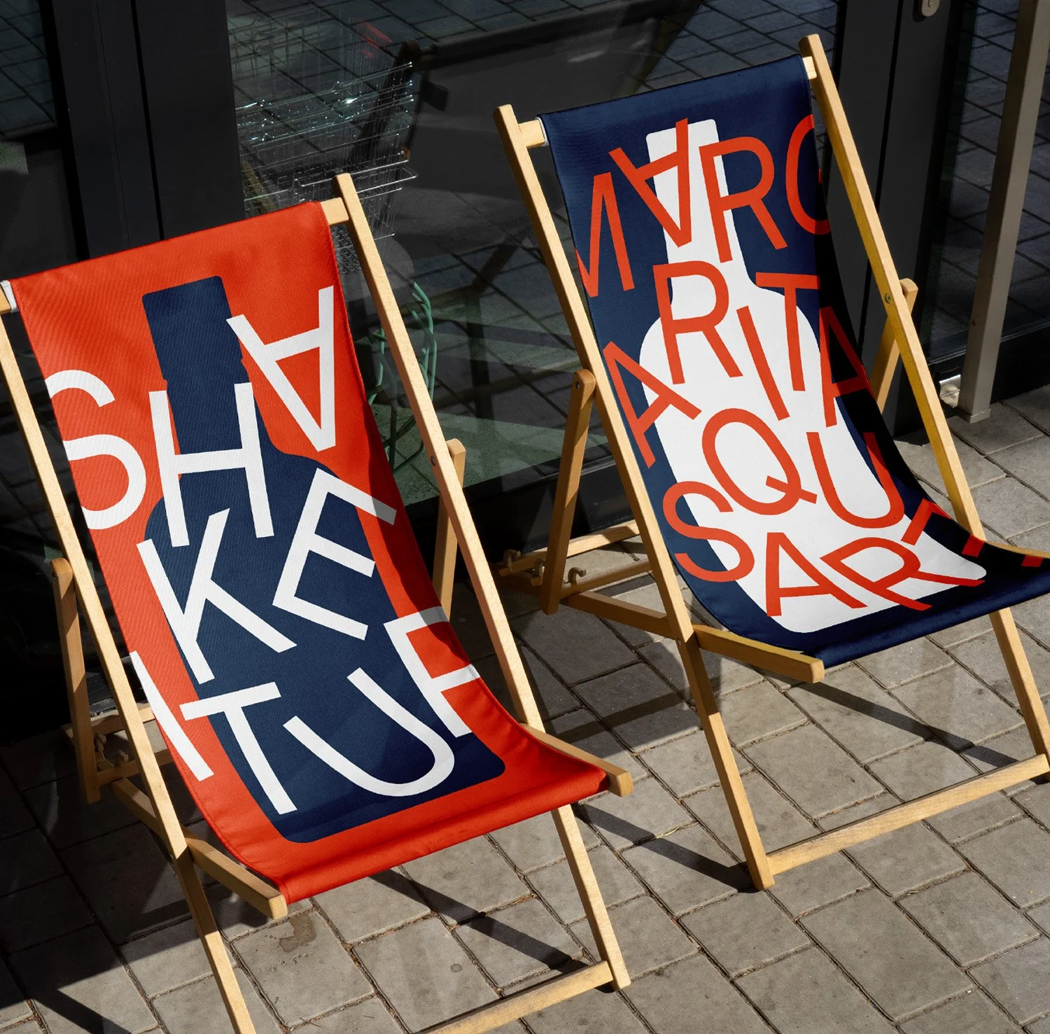
EVENT CHAIRS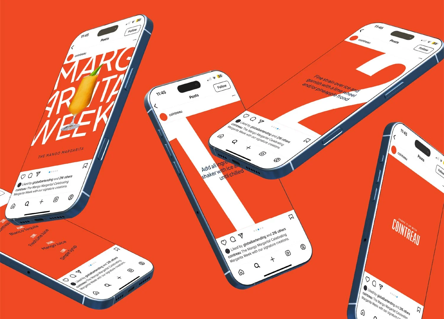
SOCIAL MEDIA COMMUNICATIONS-
A versatile and unique liqueur, making it an exceptional and refined addition to your (drink) library. Acqua Bianca is thoughtfully re-imagined from an authentic 1800’s recipe discovered in an antique cocktail manual, celebrating the history and craftsmanship behind the recipe. The bottle design pays homage to this discovery by resembling the original book that inspired its creation, blending tradition with a modern twist.

MONOGRAM DESIGN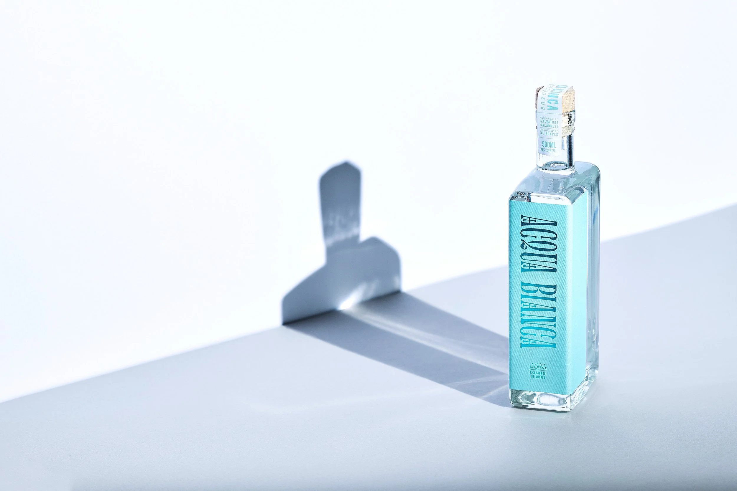
PACKAGING DESIGN 01
COCKTAIL RECIPE BOOK
ART DIRECTION
BRAND MESSAGING 01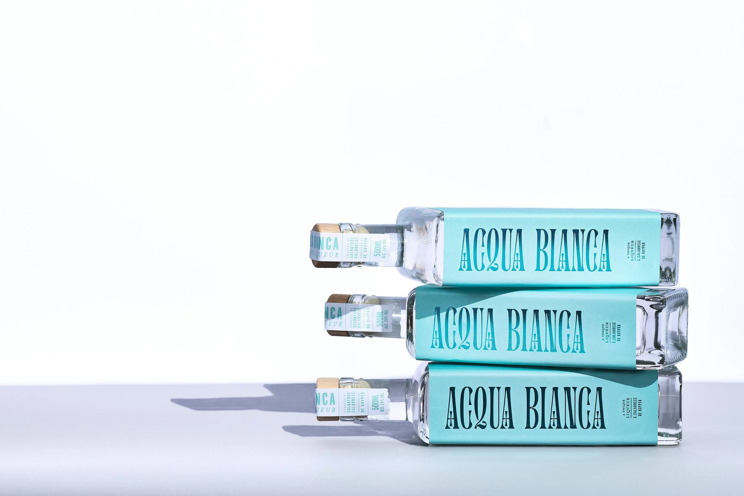
PACKAGING DESIGN 02
BRAND MESSAGING 02
IL MAESTRO-
At the initial stages of their new on-trade activations, Schweppes required their existing assets to be carefully streamlined and optimised to engage more effectively with a broader nationwide audience. This approach aimed to elevate Schweppes as a superior mixer and preferred choice among bartenders across the country.

RECIPE BOOKLET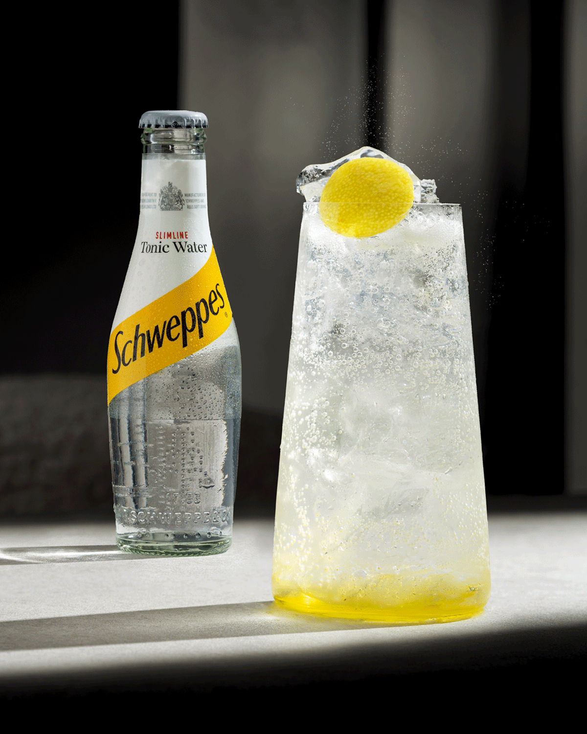
GLASSWARE DESIGN
TOOLKIT DESIGN 01
GARNISH STRATGEY 01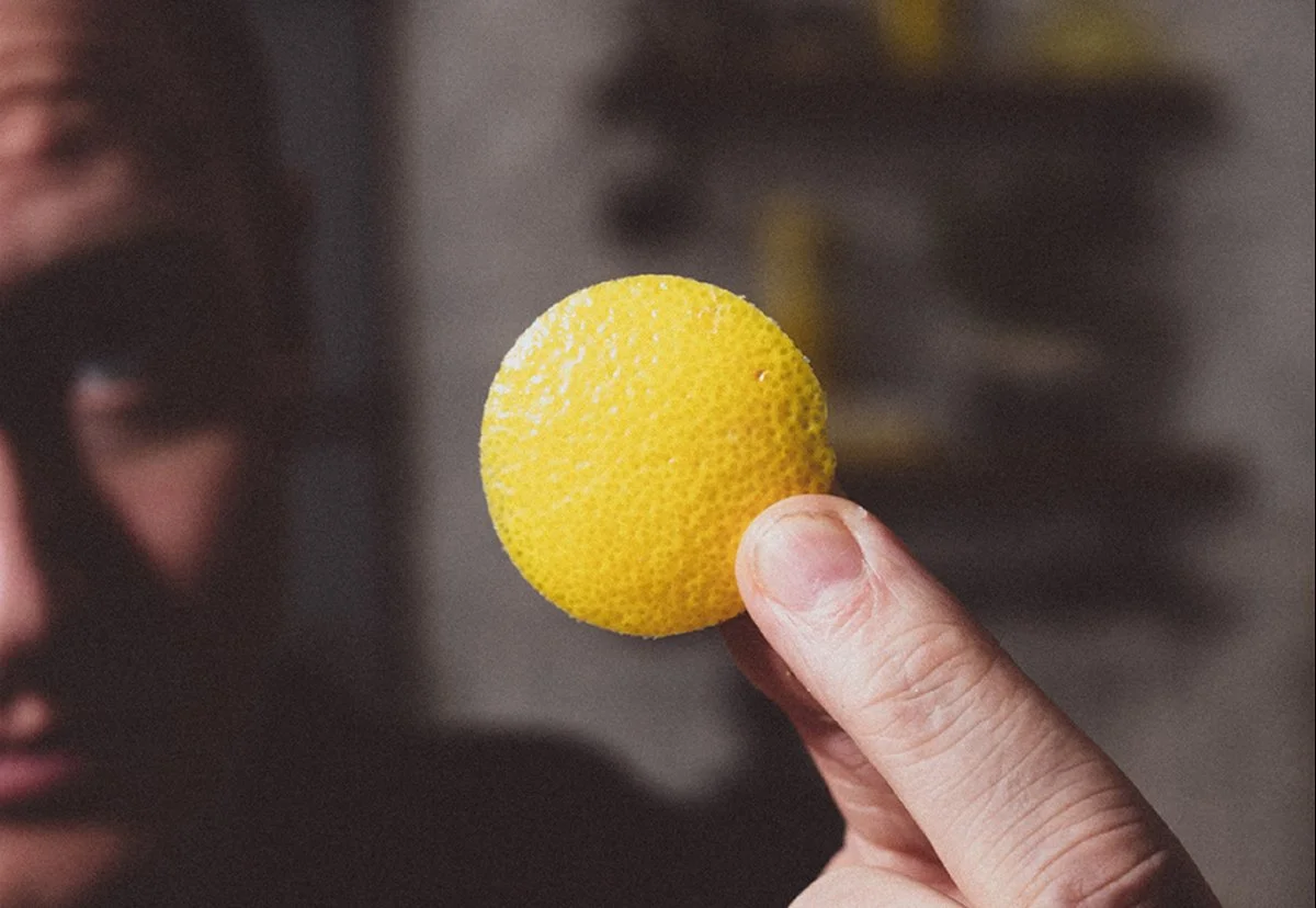
GARNISH STRATGEY 02
GARNISH STRATEGY 03
TOOLKIT DESIGN 02-
A split-level venue embedded in the vibrant heart of East London; a welcoming hub for people with a shared passion and interest in good food, good wine, and good times. The deliberately over-exaggerated, tight kerning on the logotype visually represents the sense of community and connection that comes from people coming together in celebration and enjoyment.
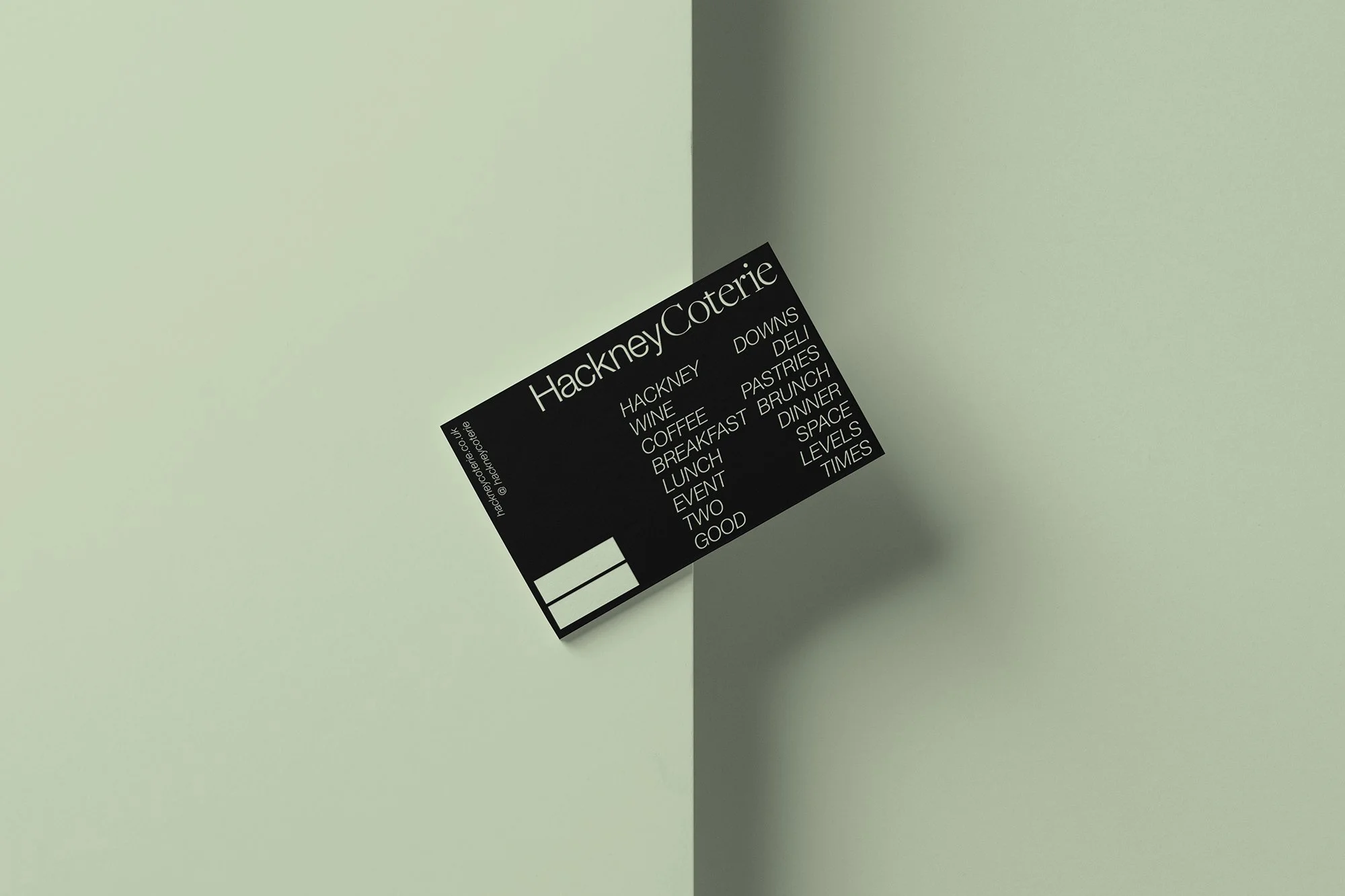
BUSINESS CARD DESIGN
INTERIOR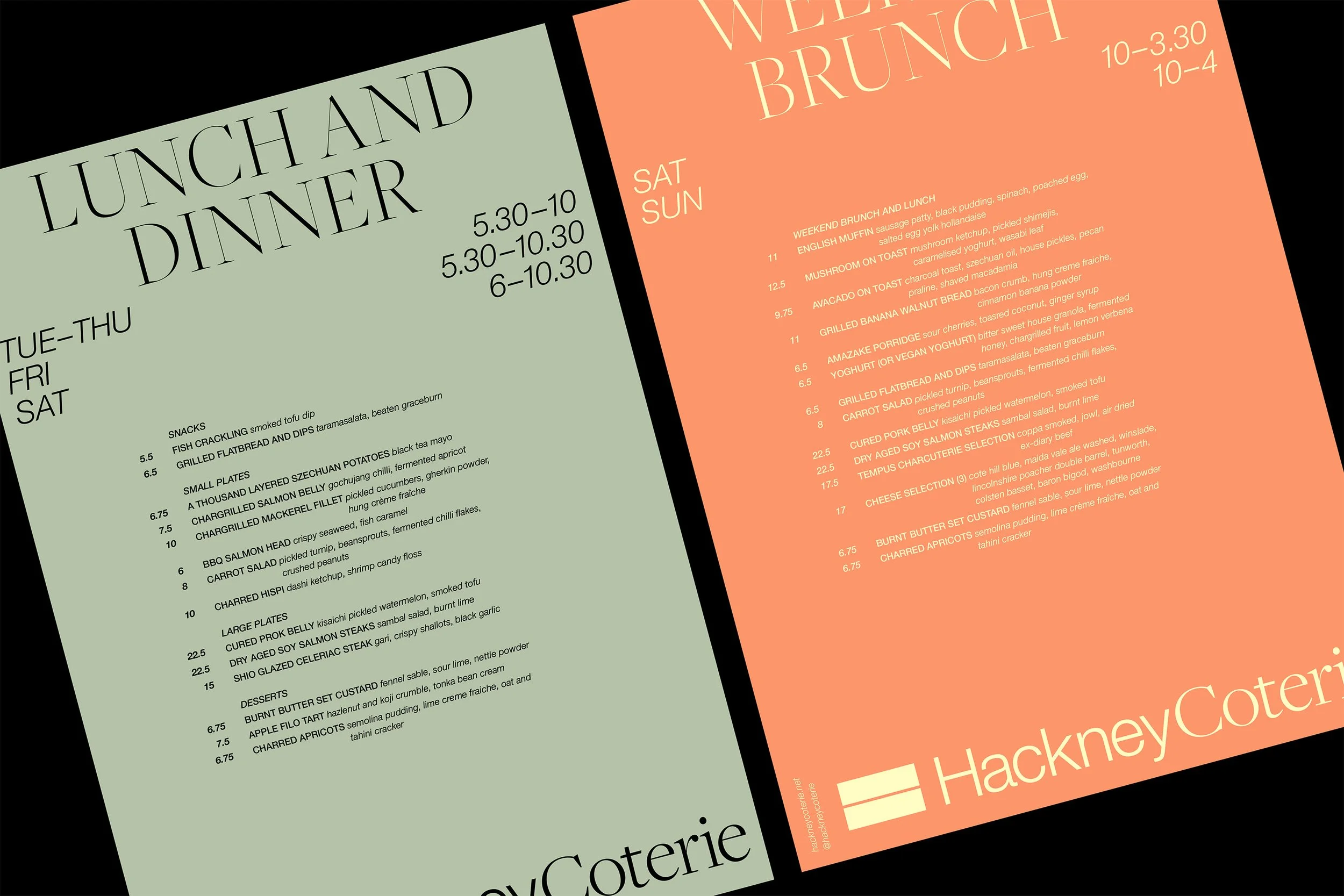
MENU DESIGN 01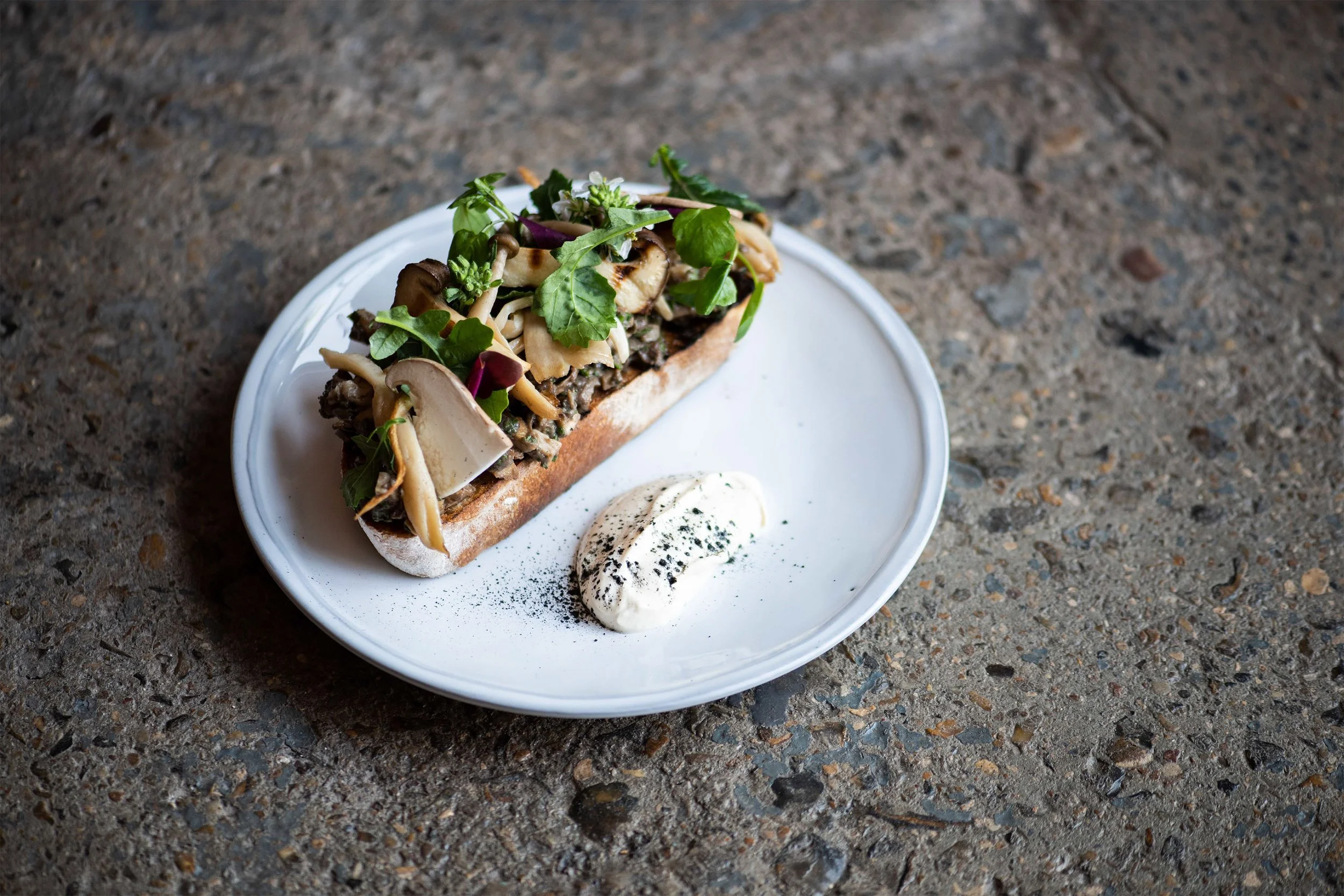
PHOTOGRAPHY 01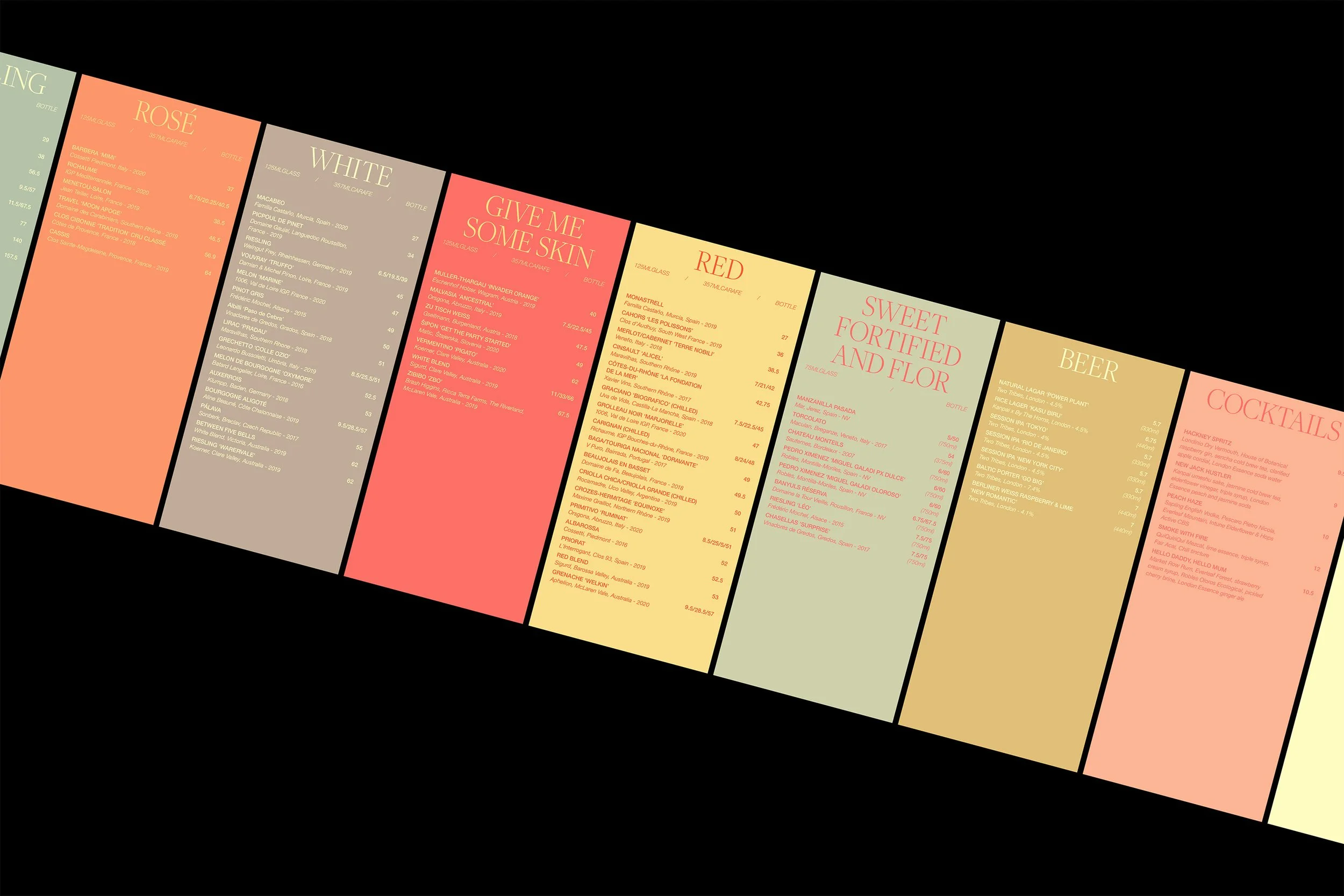
MENU DESIGN 02
PHOTOGRAPHY 02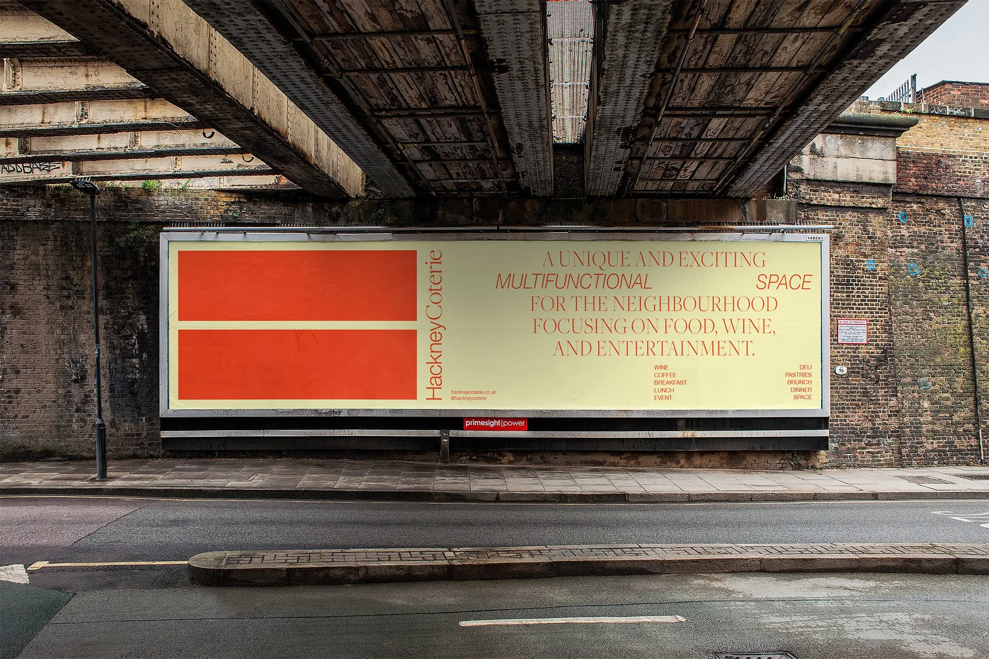
ADVERTISING